In summer 2008 I was invited to take part in the competition for the identity of Kieler Woche 09 together with
Henning Wagenbreth,
Martin Woodtli,
Patrick Thomas and
Projekttriangle.
The winner of the competition was Henning Wagenbreth with an illustrative and humerous design approach. Although my work wasn’t selected I’m showing here all the visual elements I created for this design competition (you can see all designers’ entries
here).
The Kieler Woche (Kiel Week) is an annual event in the city of Kiel, a town in Northern Germany. It is one of the largest summer festivals in Northern Europe and the largest sailing event in the world.
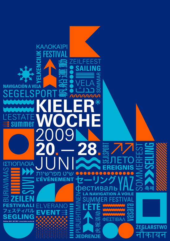
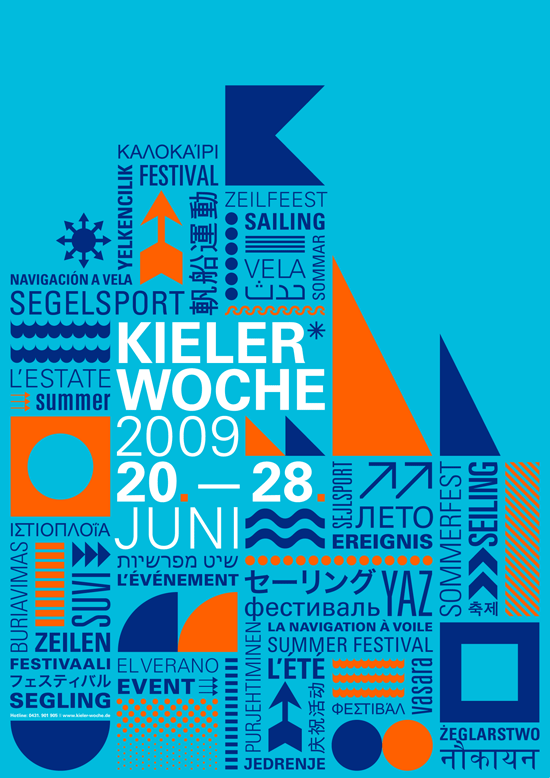
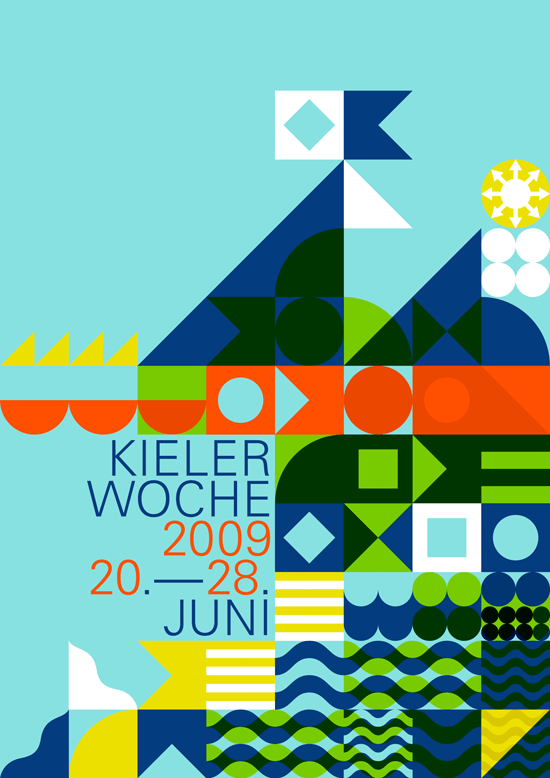
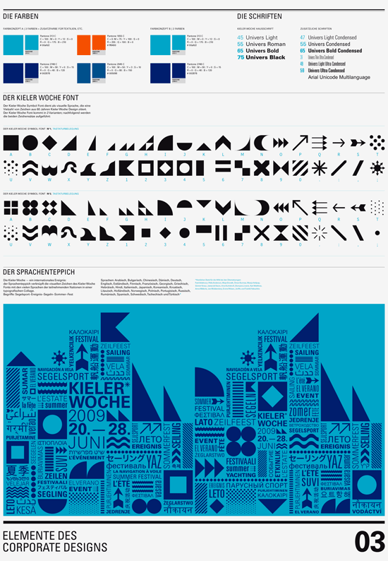
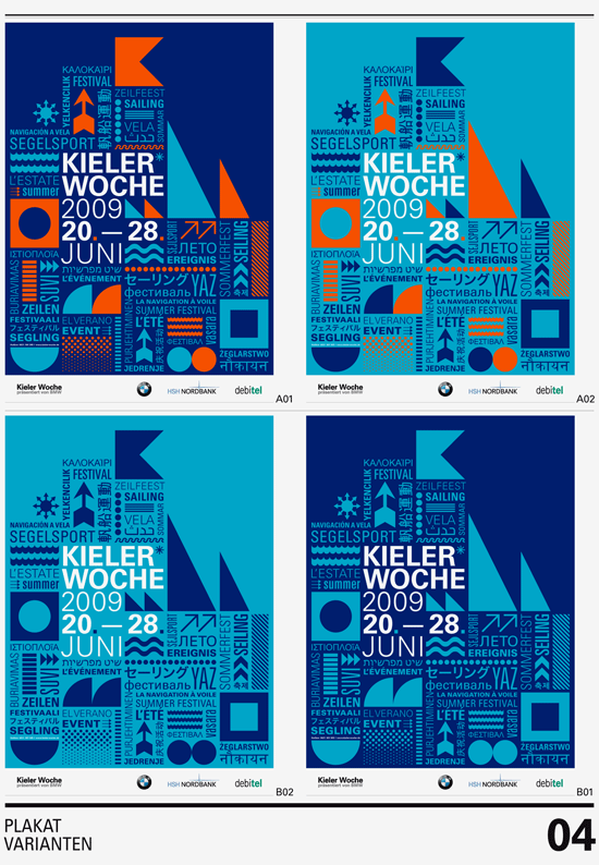
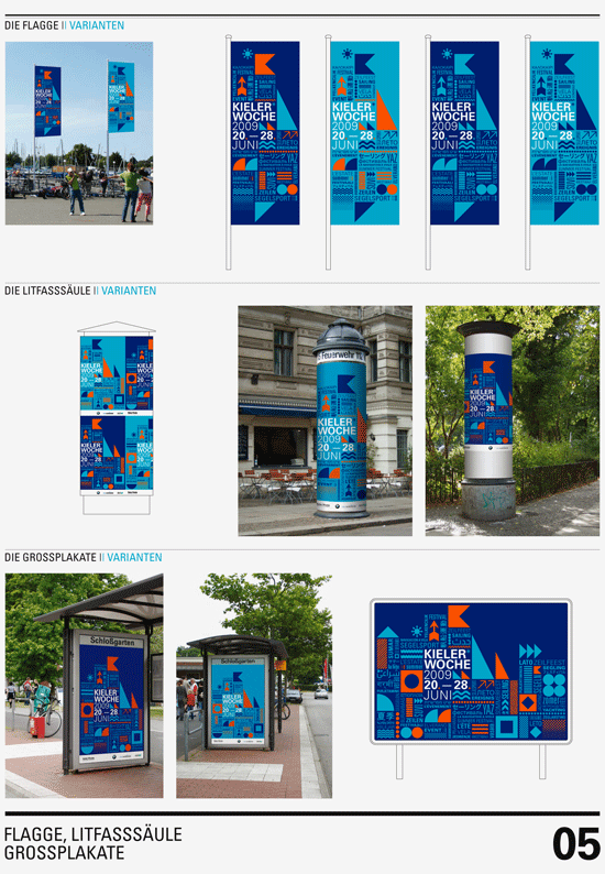
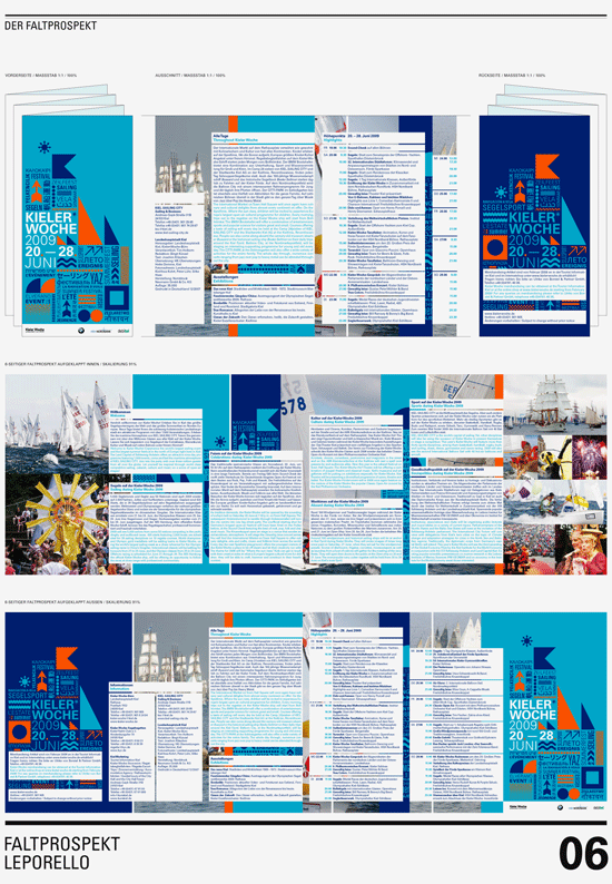
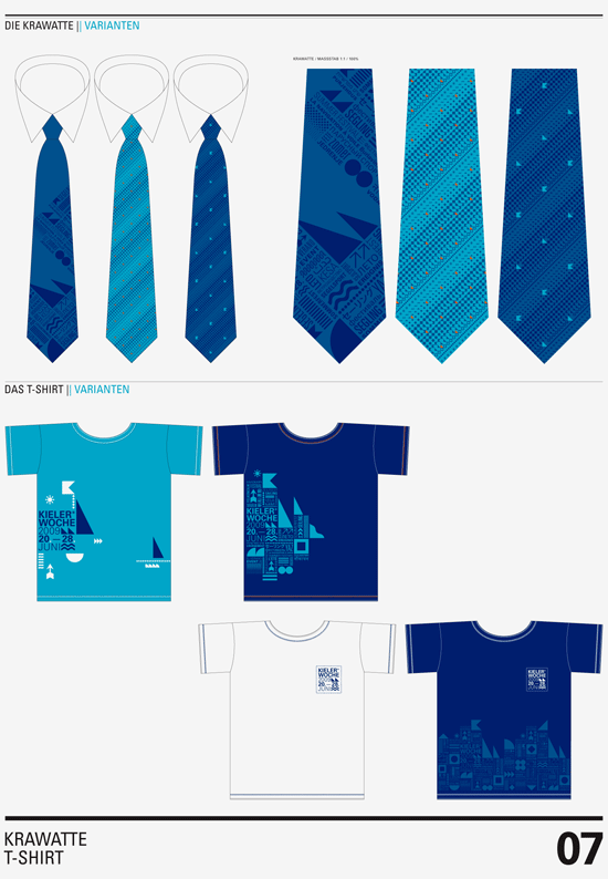
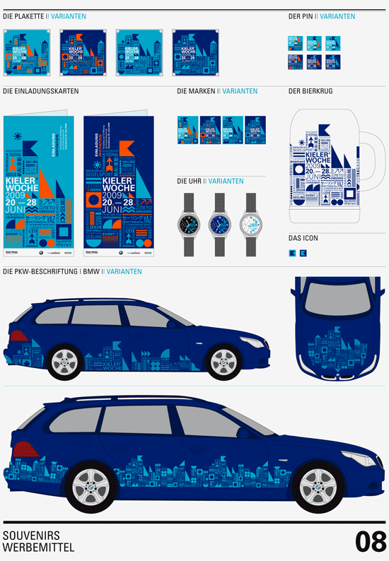
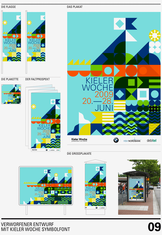
The main idea of my identity was the focus on the international character of the festival and thus on language (verbal and visual). I first designed a symbol font, quoting a variety of signs from all the Kieler Woche posters of the last 60 years. Based on a rigid grid I created a typographic structure combining the visual language of the festival with all the different languages of the participating nations. The result is a dynamic visual identity changing its structure and rhythm depending on the application.
The main words translated in all kinds of languages are: Sailing, event, summer, festival (German: Segelsport, Ereignis, Segeln, Sommer, Fest)
Languages: Arabic, Bulgarian, Czech, Chinese, Danish, Dutch, English, Estonian, Finnish, French, Georgian, German, Hebrew, Hindi, Italian, Japanese, Korean, Croatian, Lithuanian, Polish, Portuguese, Russian, Romanian, Spanish, Swedish and Turkish. A big »thank you« to everybody who helped me out with the translations (see list above).
