2011/12
Burg
project: Logotype for Burg Giebichenstein University of Art and Design Halle
client: Burg Giebichenstein University of Art and Design Halle
identity concept and design: Anja Kaiser and Andrea Tinnes
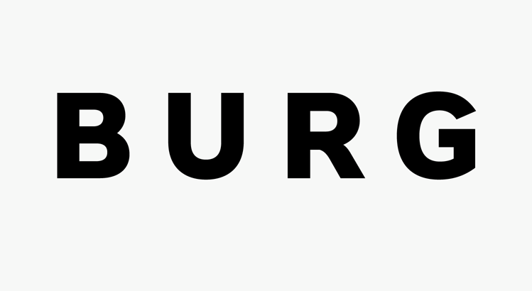
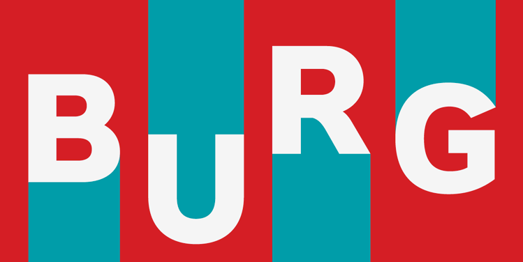
logotype: Letters based on PTL Roletta black small caps
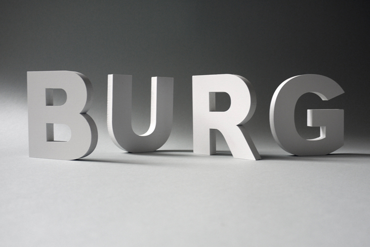
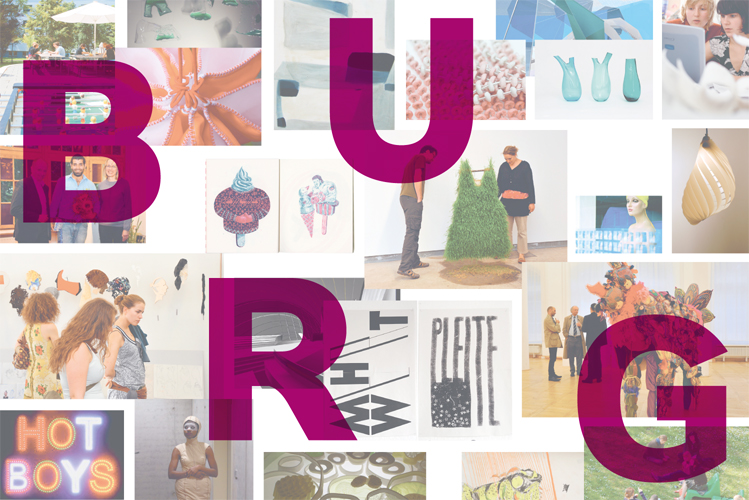
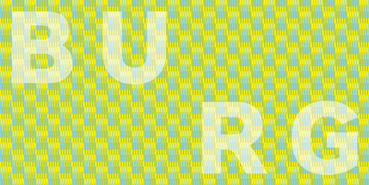
B-U-R-G: In using the colloquial short form Burg as an official term from now on, we strengthen our institution’s identity in our internal as well as our external communication. The four letters B-U-R-G function as a distinctive sign, as a stamp and mark in different constellations. And it is exactly in these letters that individual interpretation can be opted for: The B-U-R-G letters can be arranged in a freely chosen order, ranging from very subtle to really noisy and explosive. There are no limits to artistic and design freedom, however the letters are arranged depending on the individual’s taste of shape and colour. The connection to the institution still remains clearly recognisable.
